Table of Contents
Grafitti Requirements
Feature
This project will feature a dynamic search feature by letting the user find different graffiti by clicking on the map. It will also feature user friendly data presentation by clearly distinguishing the text from the pictures.
Prerequisites
If you are on the main page, you have to at least enter something for the search or clicked on the map to get your search results! Otherwise there are no prerequisites—our goal is to make this page as accessible as we can!
If this application is used by more and more people (in thousands or millions), we would consider that the user must subscribe to use it. In this case, we should require the user to log in in order to use this application.
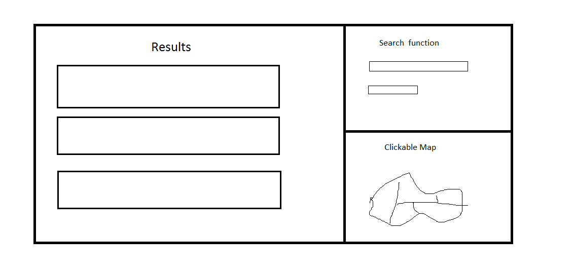
What a User Sees
The page will be divided as seen above. The search will include a textbox to search for a particular string. The map can be used to limit the region that is being searched. The results page will include have all the graffiti found in the search in separate boxes as shown. Only a minimal amount of information will be shown in the box, such as the text written or image drawn and the box can be clicked to expand the result and show more detailed information.
What a User Does
The website will be organized so that users can search for the entries about inscriptions specially based on where they were found, as opposed to topically. In the interest of making the website user friendly, we will have 2 different primary forms of search available on the home page.
Users will be able to decide to search using the map, and zoom into a particular region of the map. All of the entries available within the selected section of the map should be returned as results.
Alternatively, the user will be able to use a simplified topical search to get results. The user, will be able to choose from the options on a menu based search option to specify where they want to look, and will be returned all of the entries found within that space.
The user has to understand how the mapping system for the inscriptions works. We'll try to have a labeled map, but they should know something about the system, because we won't have an explanation of why the site is organized by space. For the graphical map-based search, it should matter because it's point and click. For the topical search, if they don't know what 1.8.7 is, it'll be hard to search. Since we're using a limited data-set, we probably will use drop down options so that the user has to enter valid data. We'll have sensible defaults if the user doesn't enter a lot of input options.
Behavior of the Application/Feature
There are two types of search the user can perform.
Map: The map will be contained within a border. If the user clicks on a valid sections of the city withing the map, it'll zoom in and take you to the results page with all the entries in that section of the city and another map on the side that they can further zoom into. If they click on an invalid section, the map will not do anything, so if they click a street, or outside the border of the city, the map shouldn't register that click. The user will be pretty tied down in map search.
Topical: We'll have a search bar type interface, that looks like any other search engine. IF the user chooses a bad search query, we will still ask the database for that input, and return that there are no entries. We won't do error checking on the input. They'll have to have an idea of what to search for to use the topical search.
Example Use Cases
1) The user does not know Latin and is not familiar with classics. The page should be readable to her, so only the most important information (year, places, in-scripted texts or images) are displayed
2) The user wants to know how many ancient inscriptions in a certain area, for example, block 1.8.5. Also, the user would want to know where exactly were each of the inscriptions located. So the user can search by the map. Also, the user might want a map of Pompeii.
3) The user would be doing an archaeology research, so she wants to know that what kind of inscriptions would remain and be pictured. It would be easy since our page makes it clear which of the inscriptions are taken photos and which don't.
Priority
High: Getting the big picture going by first being able to use all the functionality for a section of Pompei, I-8.
Medium: Getting the functions more user friendly and pretty as well as adding features for users to add more information.
Low: Branching out further and getting the rest of the maps going.

